Photoshop Water Texture Tutorial FROM SCRATCH!

WARNING: THIS WAS DONE IN PHOTOSHOP CS6 AND WON’T BE THE EXACT INSTRUCTIONS FOR OTHER VERSIONS OR EDITORS. THIS WILL MOST LIKELY NOT WORK WITH
OTHER EDITORS.

When you see what you’ll be making, you may think it would be hard and time consuming to achieve. This takes me around 3 minutes to do and is not hard. This tutorial is rated Easy.

This is what you will be making:
Image
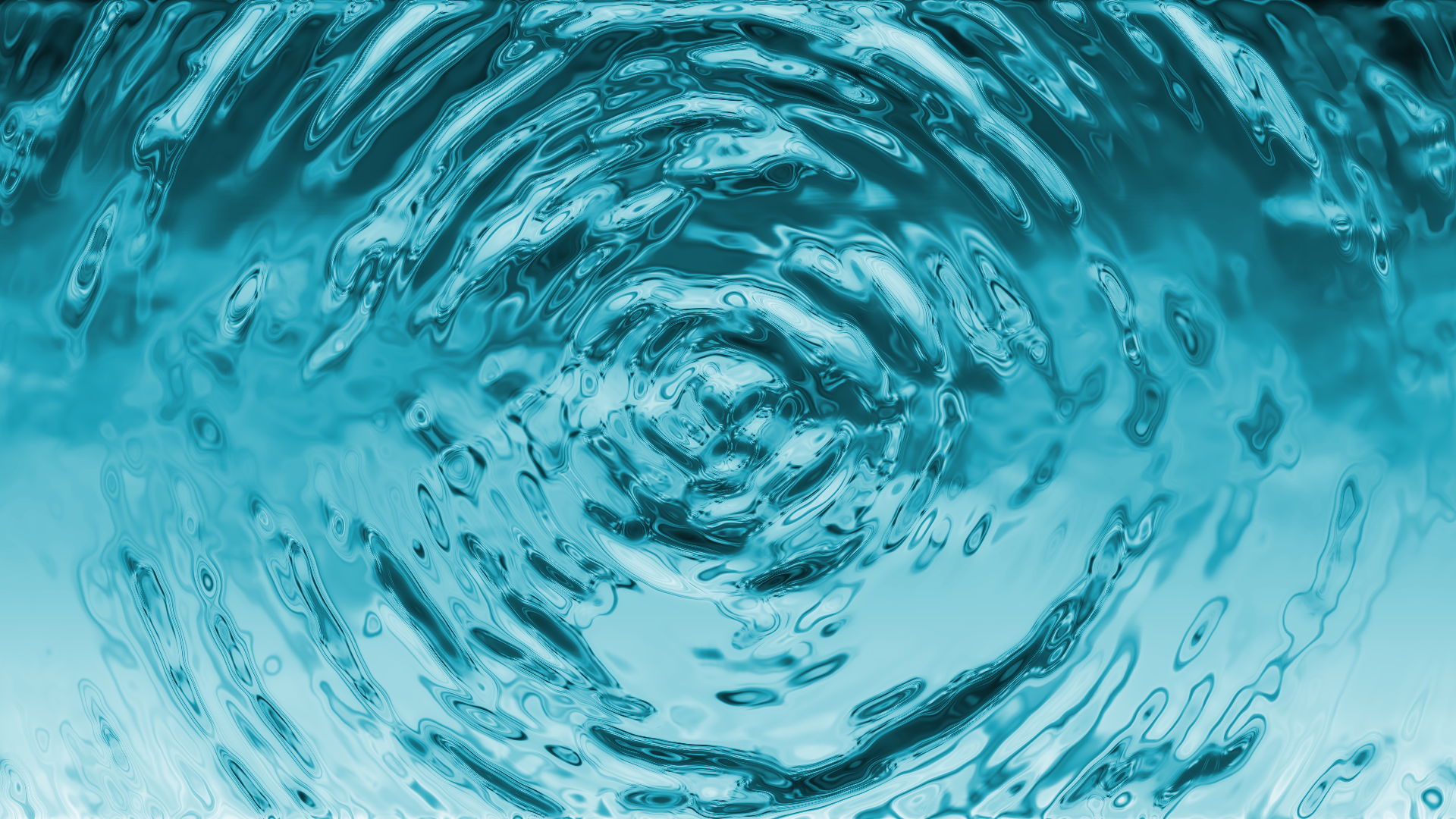
Looks complicated doesn’t it? Perhaps the colour was a bit too light but you’ll be making your own now. The following steps will not reproduce the exact picture above.

Step 1. Create a blank canvas. Mine was 1920×1080 (also my screen resolution) so you
may want to make it your screen resolution if you’re looking to make a wallpaper.
The size really doesn’t matter but I would recommend at least over 800×800.
(Still works well on 800×800)

Step 2. Render a cloud layer.
Filter -> Render -> Clouds.
It won’t look like water yet. Also, make sure it is Black and White as with your colours.
(Hotkey: D)

Image

Image

Step 3. Radial Blur.
Pretty basic stuff. Filter -> Blur -> Radial Blur.
Image
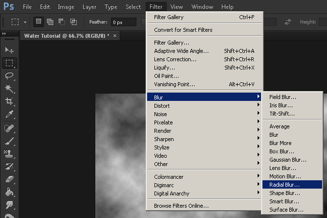
You’ll get a small window to appear. The amount is probably 10. You’ll want to ramp it
up to 40. Make the quality BEST and press OK. The clouds will look spinny now.
Image

Step 4. Adding Bas Relief.
You may not know what this is but that’s okay. You don’t need to know what this
is anyway. It’s like French in school: you don’t know what it means but you use it anyway.
Filter -> Filter Gallery
ImageBehold the almighty effects of Photoshop. You may not have known this existed if you’re
a beginner but it is a very cheeky way of getting around things.
Click on the ‘Sketch’ tab. Bas Relief is the very first one there.
ImageImage

You can see my values above. 10 for Detail and 2 for Smoothness.
Feel free to mess around with these values – better time for it later though.
Don’t click OK! If you have it is no problem but it is nicer to adjust this way:

Step 5. Making it liquidy. (Chrome)
You’ll see Chrome right underneath.
Create a new Filter Layer.
Image

Click that little button. It looks just like the New Layer button, doesn’t it?
Your picture will turn really gritty – don’t panic!

Click on the Chrome button right underneath the Bas Relief.
I don’t know about you but I like my water wet.
Change the Detail to 0 and the Smoothness to 10.
Step 5.1
Now would be a good time to fiddle with values in Bas Relief if you want.
(Click on the little Bas Relief thing on the right, it should go a darker colour)

Step 6. My Baby Blue
Not bad. For Mercury.
Let’s cook some meth. No wait – that’s a different tutorial.
The final stretch is very easy and simple such is the case with fine tuning.
Create a New Layer and fill it with a blue colour. You’ll be able to change it later if you don’t
like it. Change the Layer’s blending to your liking. I picked Screen for my colour.
You can use Overlay, Soft Light or Colour too – I’d recommend checking those out as well.
Image

Aaaand… FIN.

Here’s what I got:
ImageI hope this helped you! Make sure to post a comment on how helpful you thought this was.
Leaving a like also helps me determine whether I should make more!

Some Vegetation Icons!

I spent a while in Photoshop making these little vegetation icons. Hopefully you can see what they are. Each icon is 64×64 if you apply a grid – not for use with RPG Maker VX/Ace as those icons are 24×24.

Eventually I will complete some more and put them into an Icon Set for RM but for now their progress will stay right here.

Realism isn’t the point of these icons (in case you didn’t already notice) but instead look more cartoony. I will remake some of these later. I think the Leek, the Potato and the Pumpkins might need a bit more work.

ImageMany people seem to think that pixel art is the way to go when drawing icons. It really only works when you have lots of time and a small canvas but even the small canvas can have drawn work. For the RM conversion I will scale them down and by the looks of how a test came out, it seems to work very well.

Also I’m not limited to vegetation in this small set – I will do some other things (but mainly food.)

Photoshop Wood Texture Tutorial (And other editors!)

WARNING: THIS WAS DONE IN PHOTOSHOP CS6 AND WON’T BE THE EXACT INSTRUCTIONS FOR OTHER VERSIONS OR EDITORS.

It’s fairly easy to make a fake wood effect in Photoshop – even for beginners. This tutorial is rated Easy.

I will be going over the steps in Photoshop, however, it is very easy to replicate these simple effects if you know how in your preferred editor. Paint doesn’t work FYI.

1. Create a blank document. The size I used was 1920x1080px which, if you didn’t know, is full HD for YouTube and monitors. Some monitors do go up to 1920×1200 though.
Image

2. Pick a nice, woody colour. You can see the exact value of the one I used below.
Image3. Go into Filter -> Noise -> Add Noise. You should see a screen like below.
I use 20%, but you may want to ramp it up higher for cooler results.

Image4. Time for the wood. Apply the noise.
You’ll want to go into Filter -> Blur -> Motion Blur.
The angle will want to be at 90 degrees and the power at 180.Image 5. Re-size the wood. You’ll notice some unpleasant lines on both edges.
Press V for the move tool or simply click on the black arrow icon.
Hold ALT (Important) and then move the top center box of the texture UP.
Image6 (Optional Extra). Add some effects. You’ll want to make it look a lighter, more vibrant brown.
You can go into [Image -> Adjustments -> Hue and Saturation] and drag up the saturation
to get a more vibrant colour.
Another thing you can do is (more complex) create an overlay layer with a gradient.

7 (Optional Extra). Creating the gradient overlay.
You will want to equip the gradient tool first of all. This is an interchangeable tool with the Paint Bucket/Fill tool. Press G to equip the fill tool, click and hold on the same icon on the tool bar until a small box appears showing “Gradient Tool”.
Image

You’ll obviously want to click that. In the top left you will see a small gradient. Click on it
(not the small arrow, the actual gradient.)
Image

A box will appear showing different gradient types. You’ll want to customize your own style
so it matches your wood. To change, you’ll want to click the small box in the bottom left of the
big gradient bar. At the bottom of the box you will see the colour of the box you selected. Click
that to go into the colour picking window.
ImageHere’s what I changed it to. You can pick colours right from your textures.
ImageTip: You’ll want the colours a bit more bright and saturated or orangey.
Now that you have your gradient set up, you can now proceed to:

8 (Optional Extra). Applying the gradient overlay.
This is really simple from now on.
Create a New Layer (Bottom Right – Looks like a Page with a corner folded up)
Tip: Hold SHIFT for straight lines.
Drag a line from the bottom of the image to the top. It should show your gradient.
Change your new layer type into either: Overlay, Soft Light or Hard Light.
I chose Hard Light for these particular measurements.
ImageYou have now made a nice wood texture! Remember: Mess around with the values. You’ll not only learn how to do things yourself but also make an even better wood texture.